The vital art of drawing badly
We must overcome the physical, technological and psychological barriers and sketch!
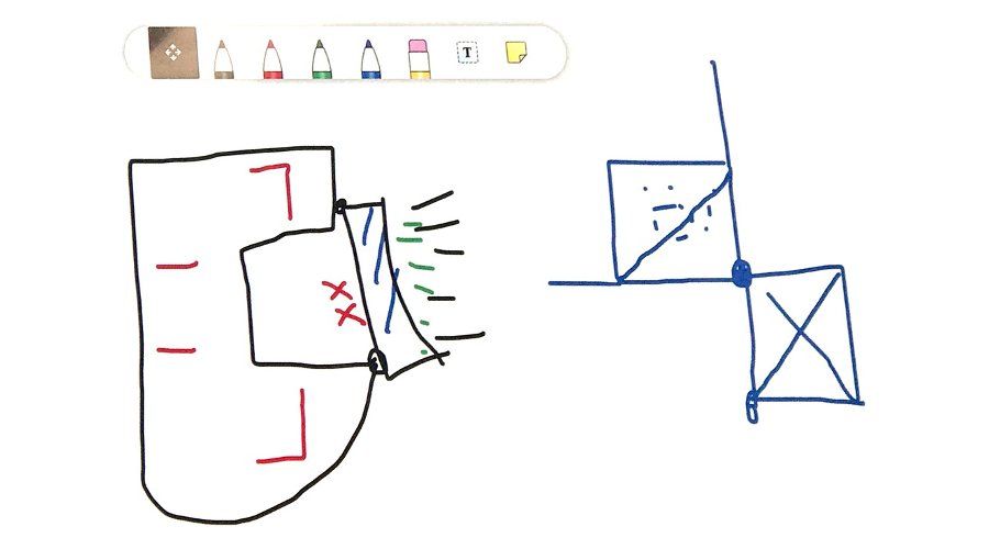
The sketch below allowed four of us to agree the stability strategy for a complex demolition sequence. The image on the left is not a dinosaur eating a brush. It is an existing composite slab diaphragm in the process of having some big lumps knocked out of it. On the right the rather frightened squarey man is actually the node that some key forces need to pass through.
Physical barriers
The arrival of the 'one per desk' PC twenty years ago didn’t quite deliver the paperless revolution it initially promised. However, it has dramatically changed the interior design of our offices and the space on our desks in particular. Much of the space that used to be available to tape down a piece of A3 paper to draw and trace has gone.
Increasingly engineering offices have been procured (not designed) by managers who need rooms to sit and talk in. As a result, engineers discuss designs in glass boxes with nowhere to pin stuff up.
For several years my job was to get to Foster and Partners' office a half hour before the rest of the Arup team so I could 'pin' up the week's work on the wonderfully long magnetic wall they had upstairs. Meetings were held in a cave of drawings. Ever since then, I have always wanted that freedom to see the evolving design on the walls. When we fitted out an Atkins office in Bangalore, I managed to cover the walls with fuzzy felt pinboards which encouraged the culture of collaborative review around drawings (and also ended up looking a bit like a soft-play area).
Returning to the UK, I was stuck in an office with three walls of glass and one walls of veneer faced cupboard doors. When I asked for a white board the only option offered was A3. Really, why even bother? So, one weekend, I wallpapered the cupboard doors with a magnetic wipeable whiteboard roll and from that point onwards whenever I was away it became a very popular room for holding meetings in!
If we want to encourage a culture of drawing review and sketching, we need to reinforce these through our surroundings. Big screens are great at what they do, but there is so much more that can be encouraged. Which brings us neatly on to….
Technological Barriers
The ability to convincingly visualise completely stupid ideas is a major problem in the modern design process.
Back in 2001 I became increasingly frustrated that my logical, thoroughly thought through drawings were no longer getting the client's attention. They were being distracted by whatever weird thing some architectural graduate had magicked up in a few minutes last night. This realisation was what made me go away and learn Rhino. If you can’t beat them, join them.
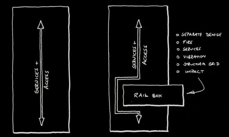
But one story from back then is worth retelling. I'd struggled to get released from a previous project and the architects had charged ahead with a hotel scheme, covering the walls with beautiful images! However, cost was a big issue for the client's project manager as this was being dramatically increased by the railway platforms needing to be jammed into the building's side.
Knowing that this would be discussed I quickly 'drew the problem' (a phrase I still often use today as it is so often not done by engineers). The presentation went very well, and the client was blown away by all the architectural images. But rather embarrassingly the only one he wanted an immediate copy of was my 10-minute sketch. It was exactly the thing he needed to explain the budget to his boss
Architects usually want to create images that show how things look. 3D visualisations are great tools for this. Meanwhile engineers want to show how things work. A sketch allows you to abstract the issues, simplify and tell a story. It clarifies the issues, both for the person holding the pencil and the final audience.
And now, suddenly, we are all working from home, and meeting via Zoom, Teams and other platforms that we'd be previously been slow adopting. The technology has worked surprisingly well, but its basic use encourages us to share and discuss images that have already be made, not new ideas that crop up in the meeting. It is important that we overcome this - and the tools are already there allowing us to gather around a virtual blank sheet of paper.
It took a while for us to make it a habit, but I am finding we increasingly open the white board. We all initially enjoyed and then got over the difficulties of drawing via mouse. If you have access to a tablet, I encourage you to work out how to link it into a shared whiteboard. The technology is all there, and the ability to draw with a stylus is transformative compared to a mouse. The technological barriers can, and must, be overcome.
Psychological barriers
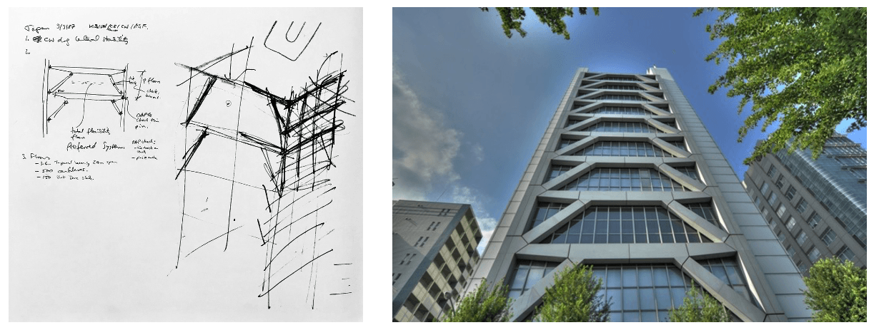
The 1987 sketch below is by Tony Fitzpatrick, the Arup Director I worked with for seven years. It is the Foster and Partner's Century Tower in Tokyo and predates my time in his team. I don’t think Tony would have minded me saying that it is not a great piece of art. He was actually not that great at sketching - but he did it all the time regardless.
I can imagine him talking and thinking as he did this because I heard him do those things so many times over the years. And the fact others in the room were better at drawing didn’t stop Tony. The initials tell me that Ken Shuttleworth, Dave Nelson and Chris Wise were all in the meeting - all of them are no slouches with a pencil. But it’s clear that this was an important sketch in the building's development. The photo shows it became a real building, and the sketch has been reproduced in several Arup books.
I have often run into teams that are planning a sketching course and the IStructE have recently published some great guidance about how to produce great sketches. However, the downside of these is that they reinforce the idea that you need to be good before you do it!
You probably first got given a crayon before you were 18 months old. The sketch you produced was probably awful, but your parents heaped praise on you, and it was pinned up on the wall. It could even still be in a drawer somewhere!
Remember that feeling and just get out there and start drawing badly! I love those moments when someone nervously says to the meeting 'actually, I've got a sketch' and tables it. A picture tells a thousand words, even if it’s not a work of art, and they can change the whole direction of what gets discussed next.
One final thought
There is a scene in the TV series 'Absolutely Fabulous' where Edina goes on a spiritual retreat. In group therapy you are only allowed to speak if you are holding 'the talking stick' to ensure everyone gets heard. In the end a frustrated Edina yells ‘How much is the stick? I’ll buy my own stick!'
Sketching badly in its various forms is a designer's 'talking stick'. If you want your voice to be heard, you need overcome any barriers you have placed in your way.


